C.
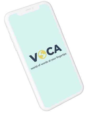
VOCA
This early UX design project demonstrates the application of user-centered design methods to create a more intuitive and motivating language learning experience. Research, information architecture, and usability testing were used to identify and address key user pain points.
Role
-
User research
-
User persona
-
Competitor analysis
-
Information architecture
-
Wireframing
-
Prototyping
-
Usability test
Tools
-
Pen and paper
-
Figma
-
Otter.ai
-
Zoom
The Challenge
Design a language learning experience that helps users learn and retain new vocabulary on the go.
Competitor Analysis


Duolingo
Offers opportunities to review mistakes and practicing vocabularies.

Excessive graphics and too many gamification elements can be visually and mentally overwhelming for some users.


Rosetta Stone

Menu bar icons have text labels for clear definition of function. Real-world pictures prevent misinterpretations.
Inconsistent transitions between horizontal and vertical screens; users unable to personalize screen orientation.

Categorized learning - vocabulary, listening, speaking/writing with AI.

Memrise

Most topics require membership - less in-depth vocabulary learning and decreases user retention.
User Research
Three interviewees were interviewed in-person using Otter.ai to record their responses. Transcripts were later categorized into three categories - "doing", "feeling", "thinking" to analyze underlying thoughts and behaviors.
Interview Questions
-
Are you a professional or a student or both? What are your responsibilities and daily routines?
-
How much time in a day do you usually spend on learning a new language?
-
Can you tell me a time when you did enjoy learning a new language?
-
Can you tell me the methods and strategies you use to retain information when learning a new language?
-
Why do you think learning a new language can be challenging for you personally and/or for others?
Key Insights
-
Using familiar topics or topics that are specific to users' interests help with engagement in learning.
-
Repetition assists in memory retention.
-
Writing or spelling out new vocabularies help with memorization.
User Persona Maya

Information Architecture
Based on insights from user research and user persona Maya's story, two information architectures were developed to identify the structure content of the app:
1. Onboarding
-
Familiar subjects help with engagement in learning
-
Take user interests into account at onboarding to make content more personalized


2. Writing practice & mistake review
-
Writing and spelling out vocabulary help with memorization
-
Repetition helps with memory retention
Mid-Fidelity Prototype
Low-fidelity wireframes were sketched out from user research and established IA. Mid-fidelity prototype was developed on Figma through the lo-fi wireframes.
Usability Test Report & Improvements
Three participants were recruited for usability test of the low fidelity wireframes. They were asked to complete four tasks. Observations and statements were rated using Jakob Nielson’s Error Severity Rating Scale.
Task 01 Complete onboarding and create an account
Severity rating
“It’s kind of confusing that it doesn’t say ‘okay, we will now start testing your proficiency.’”
“It should say like ‘okay, now we’re going to assess your level.’”
The onboarding video and conversation were confusing because he thought they were for learning.
Version 1

Version 2

Added in response to "Did I finish registering?"
Added due to all 3 users feeling unsure if the following frames are for assessment or for learning.
Task 02 Begin learning with AI messaging function
Severity rating
Placement and design of hint button is not intuitive and universal.
"It's not necessary to choose topic again since the process has been done during onboarding".
Version 1

Version 2

Moved user interest categories to the top to decrease scrolling to find personalized topics.
Hint button removed from conversation window.
Feedback showed question mark in circle is more universal than a lightbulb as a hint icon.
Task 03 Add new vocabulary to flashcard deck
Severity rating
“If you tell me the definition, and then you give me three choices, I’m a bit confused of what I need to do. I’d like to be more guided.”
The “Filter” and “Memorized” features of the flashcard deck were useful.
Version 1

Version 2

Added guided descriptions for different ways to memorize new vocabulary.
Task 04 Subscribe to app through in-app purchasing
Severity rating
Task was straightforward and no confusion throughout the process.
"Could change 'Subscribe' to 'Upgrade Plan' since users are already subscribed to the app."
Version 1

Version 2

Changed wording to be more clear for in-app purchase.
The Journey
This project taught me how essential usability testing and honest user feedback are in shaping an app that feels intuitive and accessible. Translating pen-and-paper sketches to digital wireframes on Figma came with a steep learning curve, but each iteration helped me better understand how to navigate the software and bring new ideas to life. The biggest challenge was planning the app’s layout and task analysis to ensure the user flow is clear and seamless for the users.